GitHub Copilot was rapidly evolving, but our customer journey was fragmented. Marketing pages, and billing flows weren’t aligned while upgrade paths were virtually non-existent. This created friction and confusion. I led design across key touch points to create a cohesive, adoption-driven flow during one of our biggest launches in history. Together, these changes stitched the funnel into a clearer, more compelling journey, helping developers go from awareness to trial to paid adoption with less friction.
My role
Audit web and product surfaces
Pull data and synthesize gaps
Designed initial concepts and IA
Delegated user testing and research
Drafted creative brief and provided creative direction across Design and Engineering
Coordinated outcomes and patterns with Copilot Product teams
Project goals
Improve user discoverability web updates for new releases
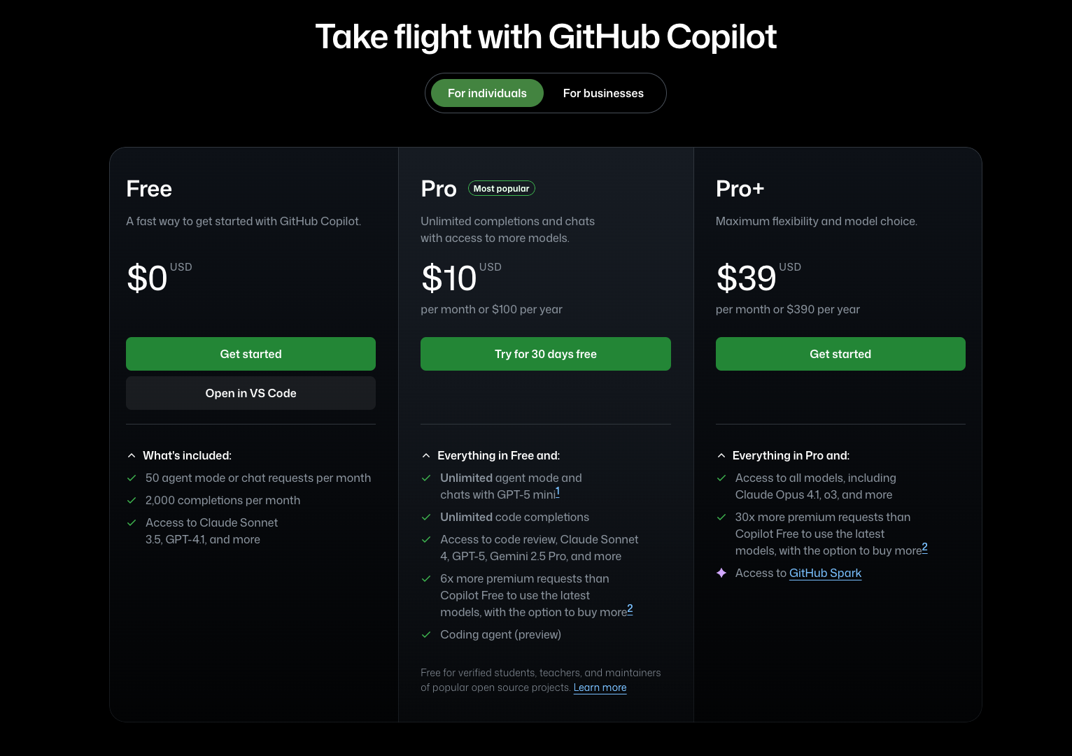
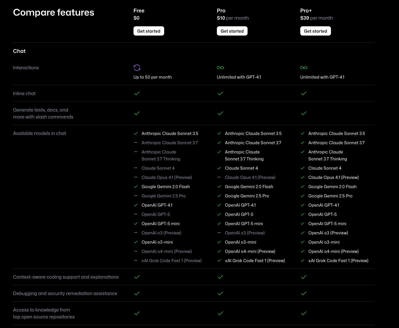
Redesigned Copilot webpages to reflect new product narrative, feature capabilities, and pricing models. These collective efforts drove awareness and adoption.
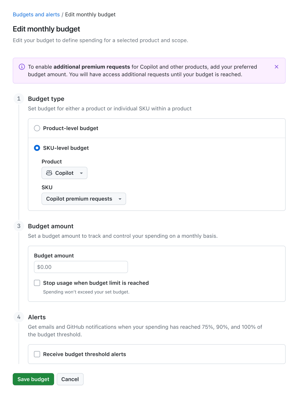
Reduce friction in the billing flow
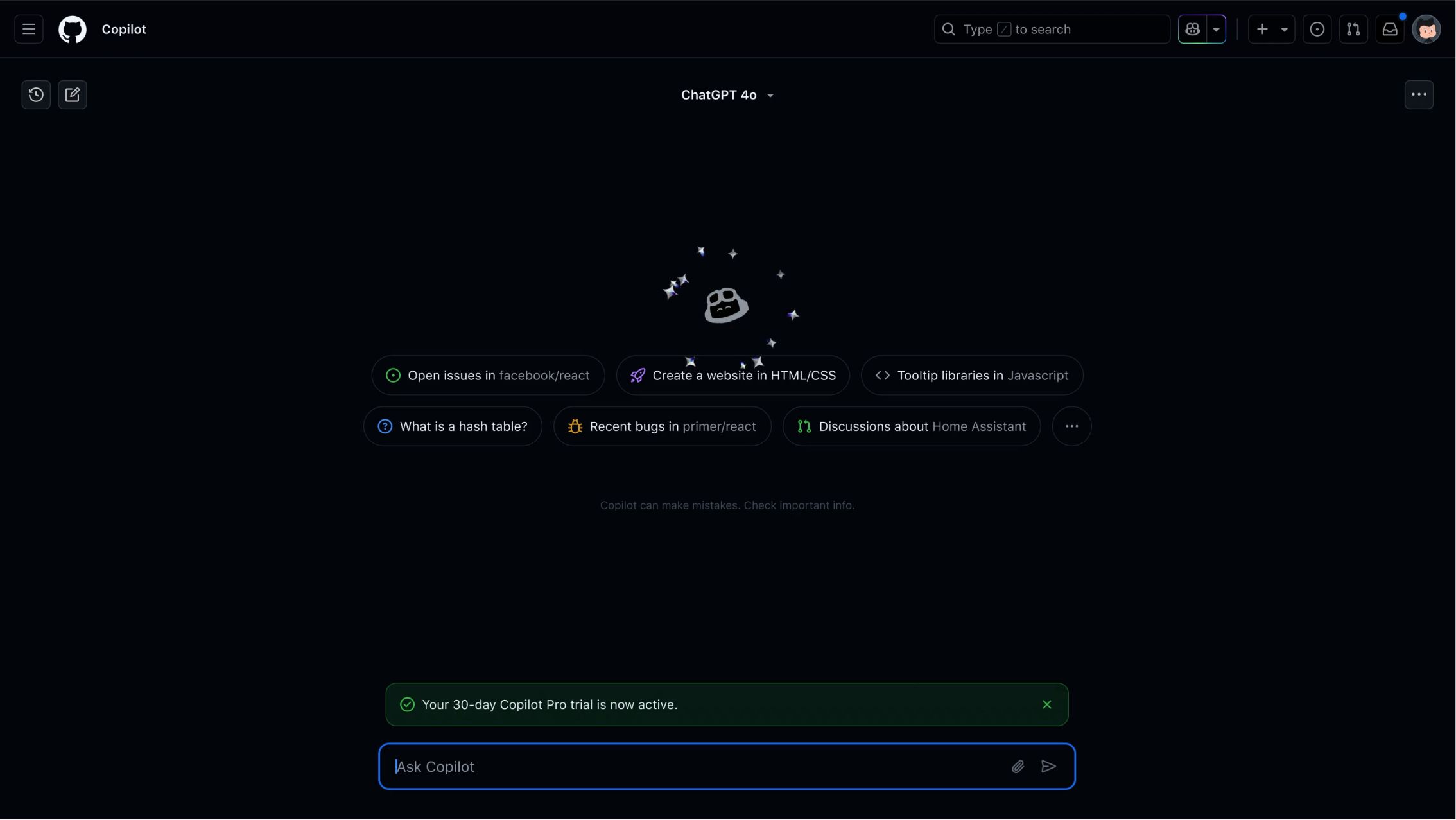
Streamlined purchase flows across IDEs, product and web experiences, leading to faster adoption and lower drop-off rates during checkout.
AI is so hot right now
Copilot webpages weren't reflecting the latest product updates, making it harder to convert interest into adoption.
So we redesigned core Copilot marketing pages to highlight our AI-powered features and clear paths to adoption. Leveraging our design system, we designed a series of landing pages within our CMS to make it easier and faster than ever for product marketing teams to deploy new pages to tell our product story. Building in Contentful allowed us to translate our entire experience to 4 new languages and extend our offering to new markets.
Before...
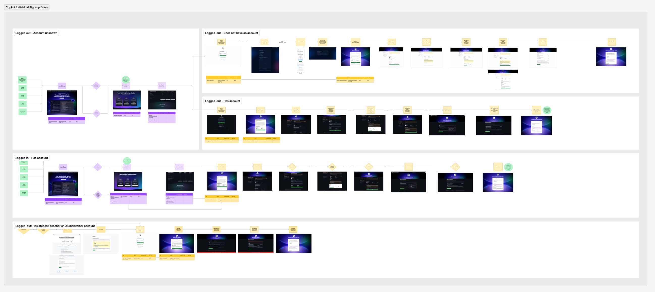
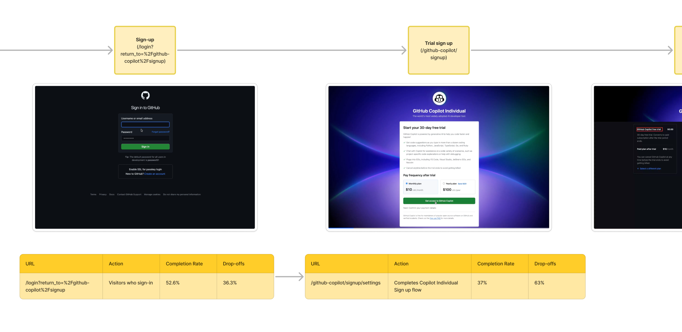
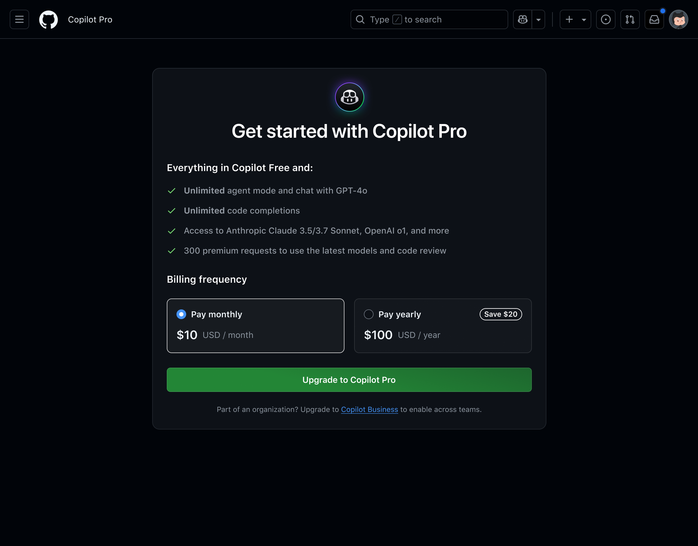
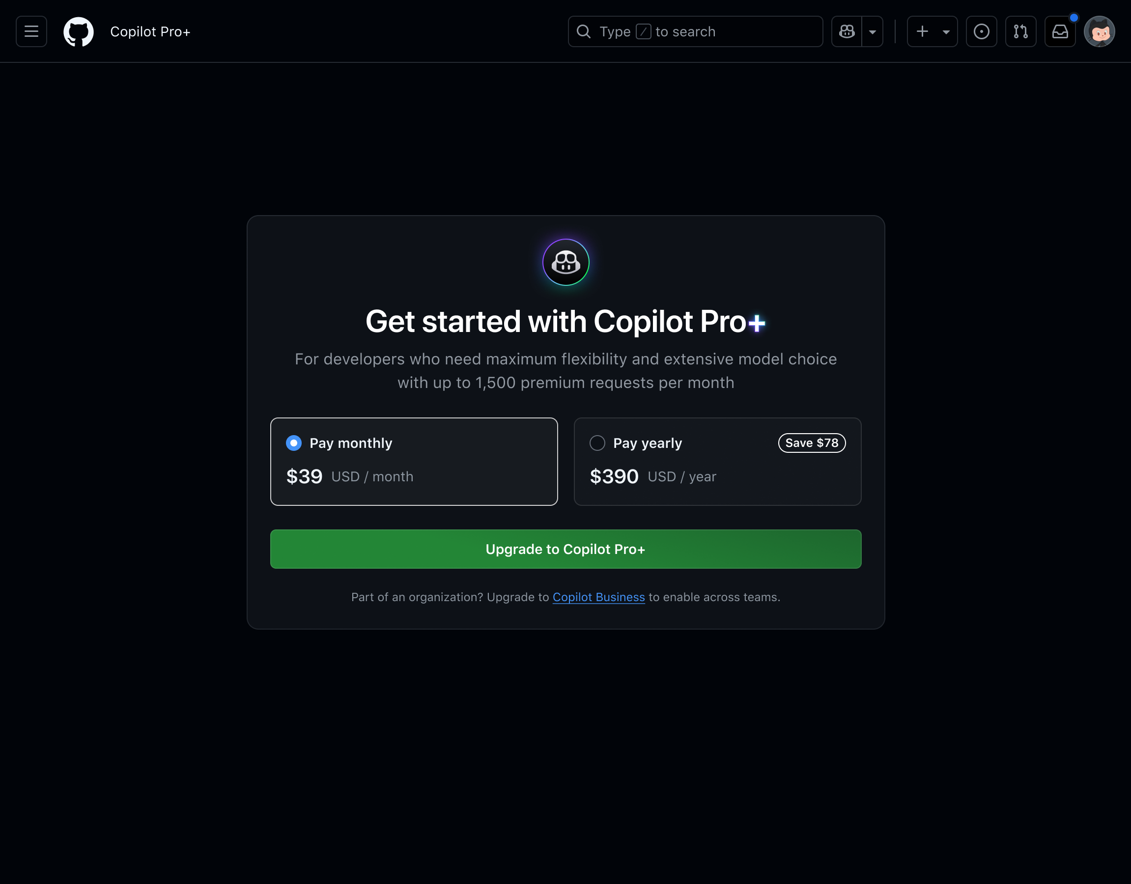
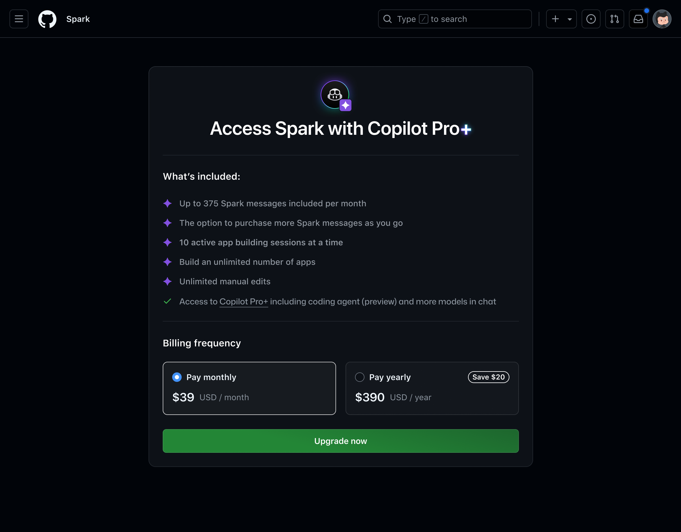
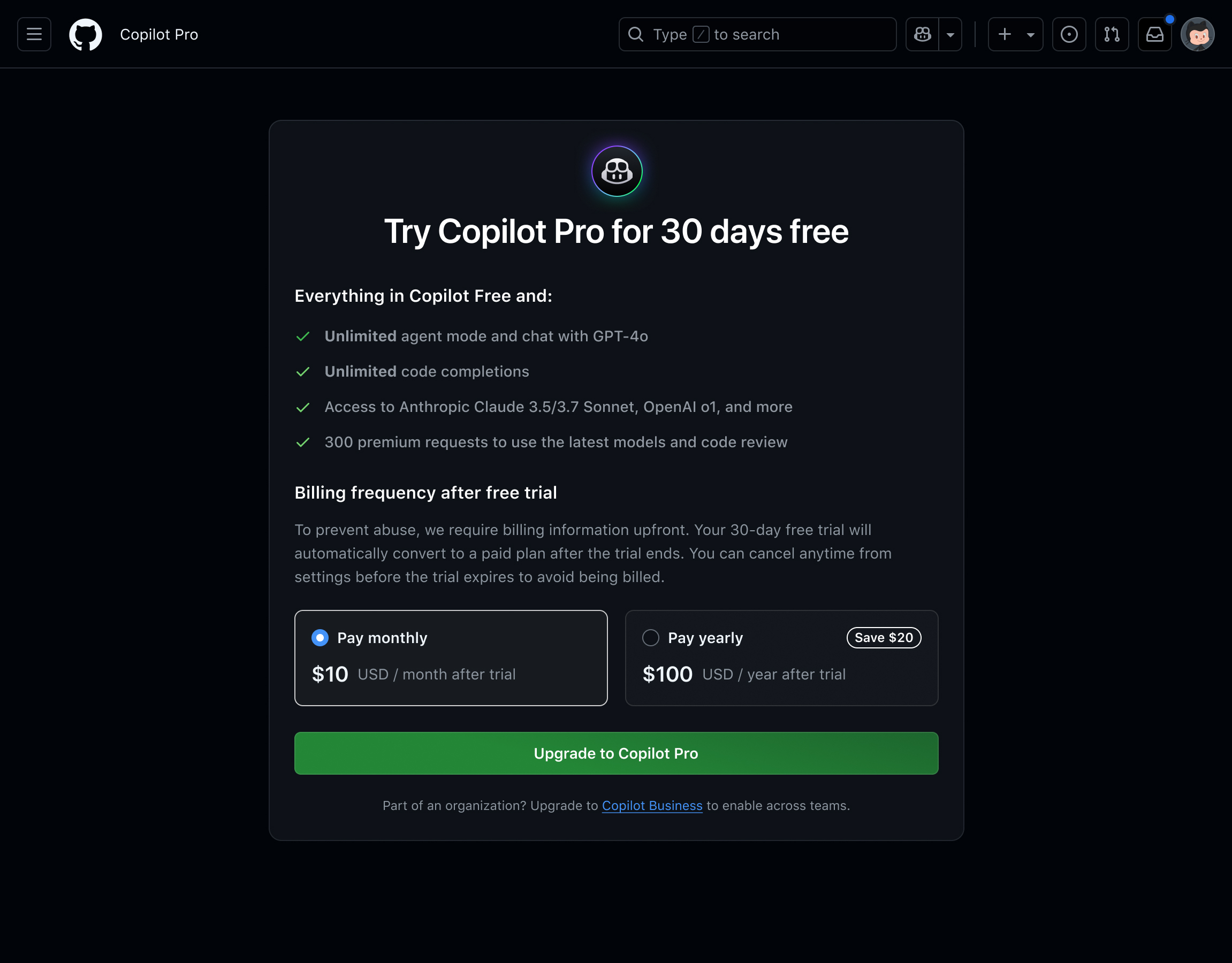
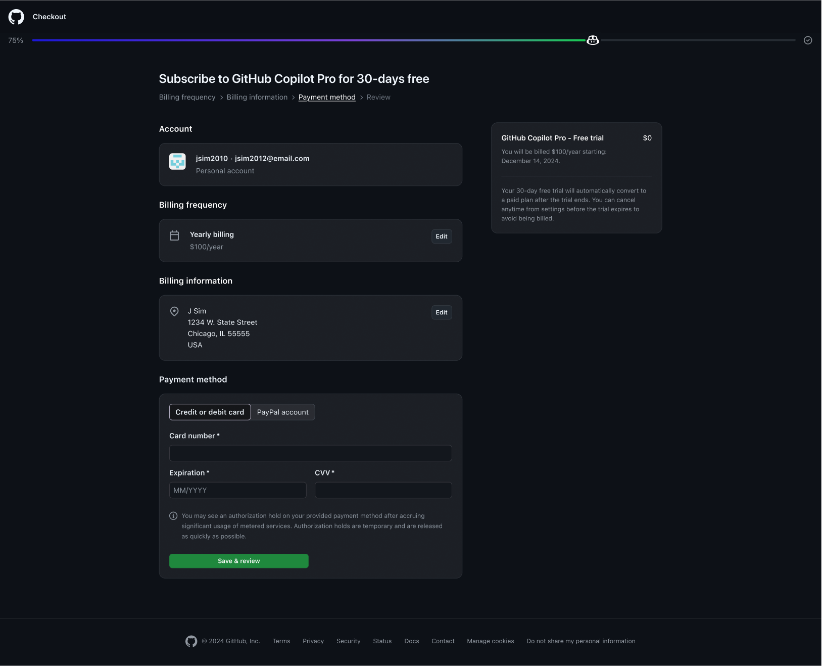
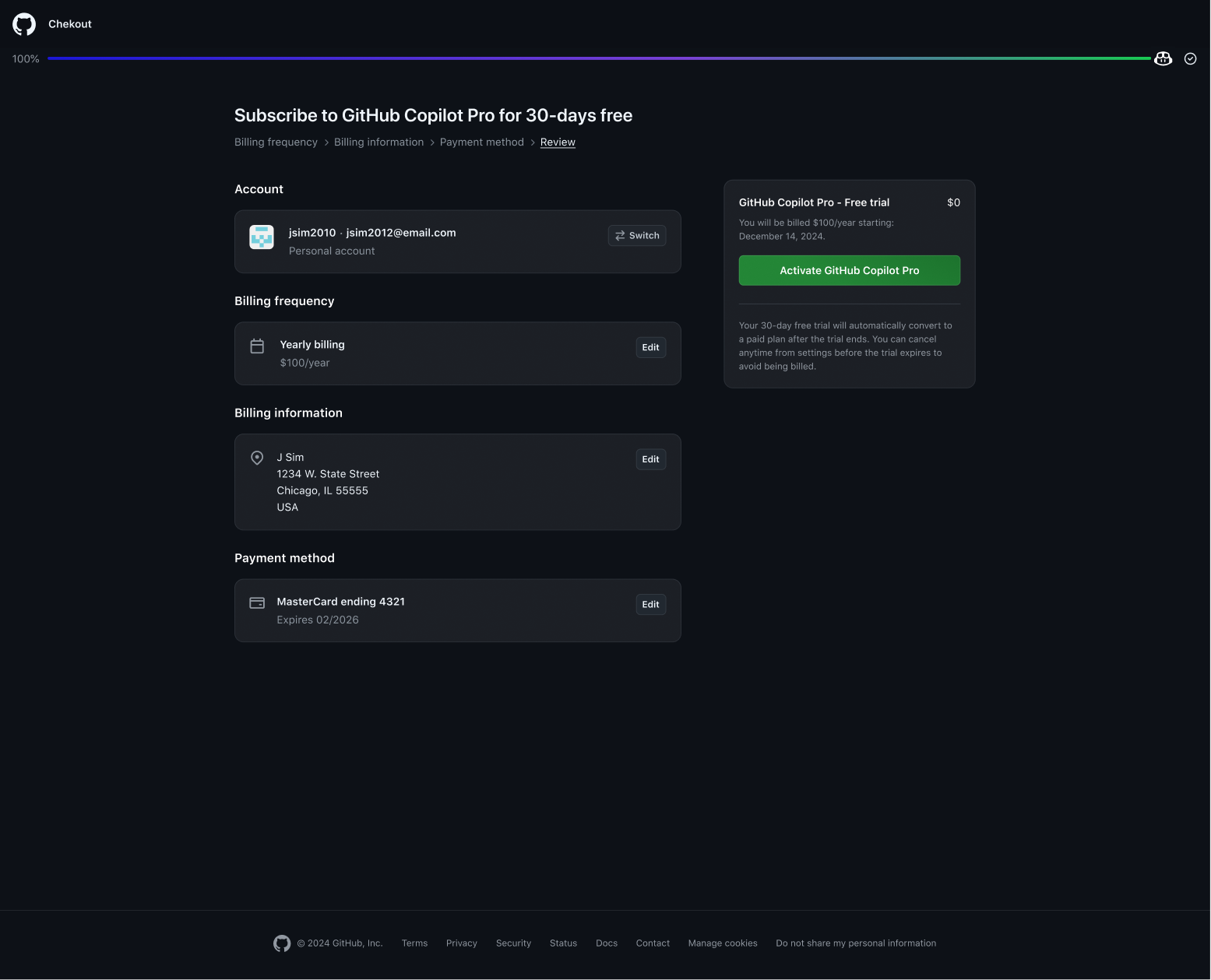
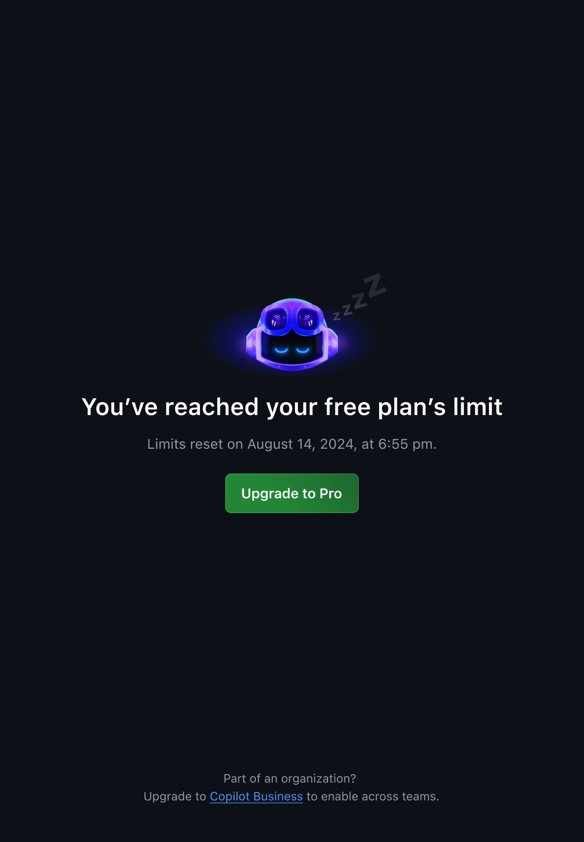
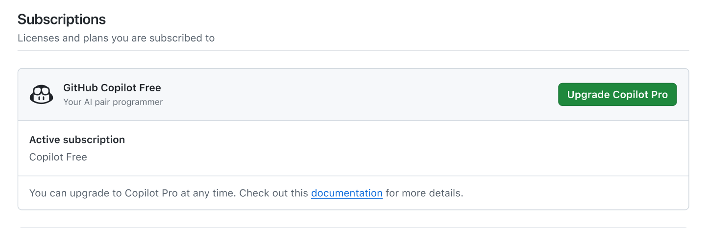
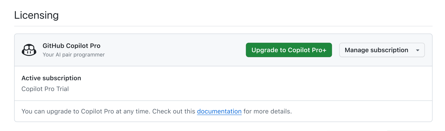
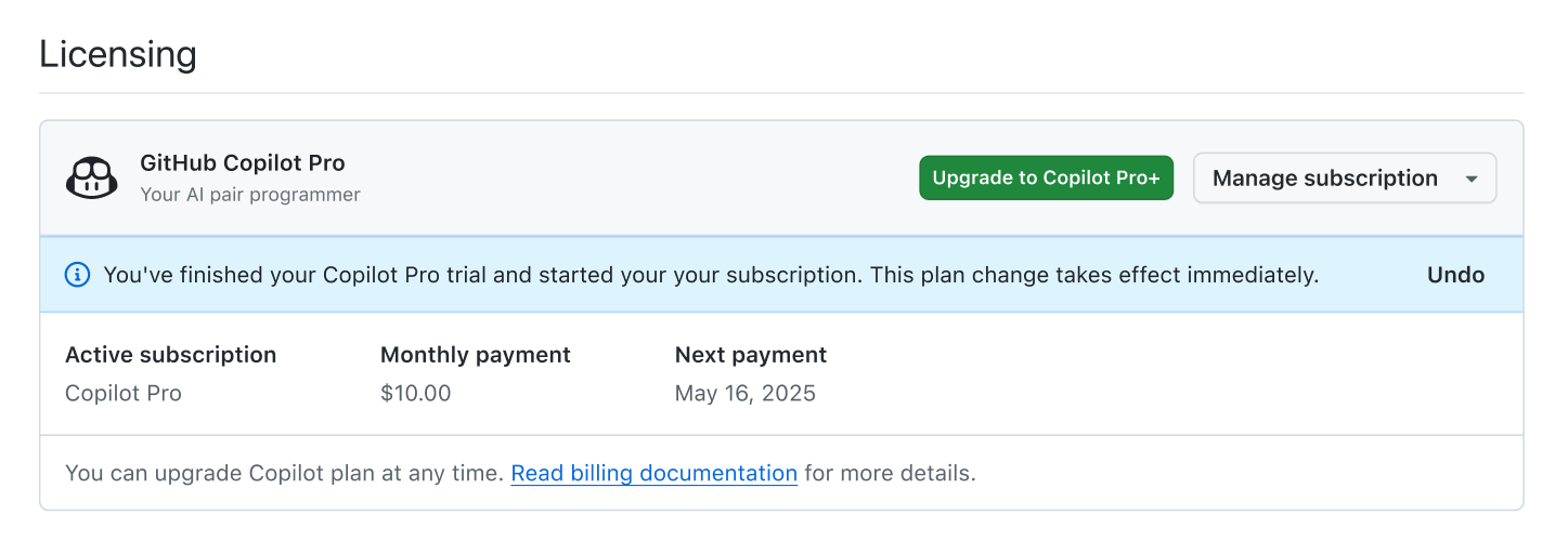
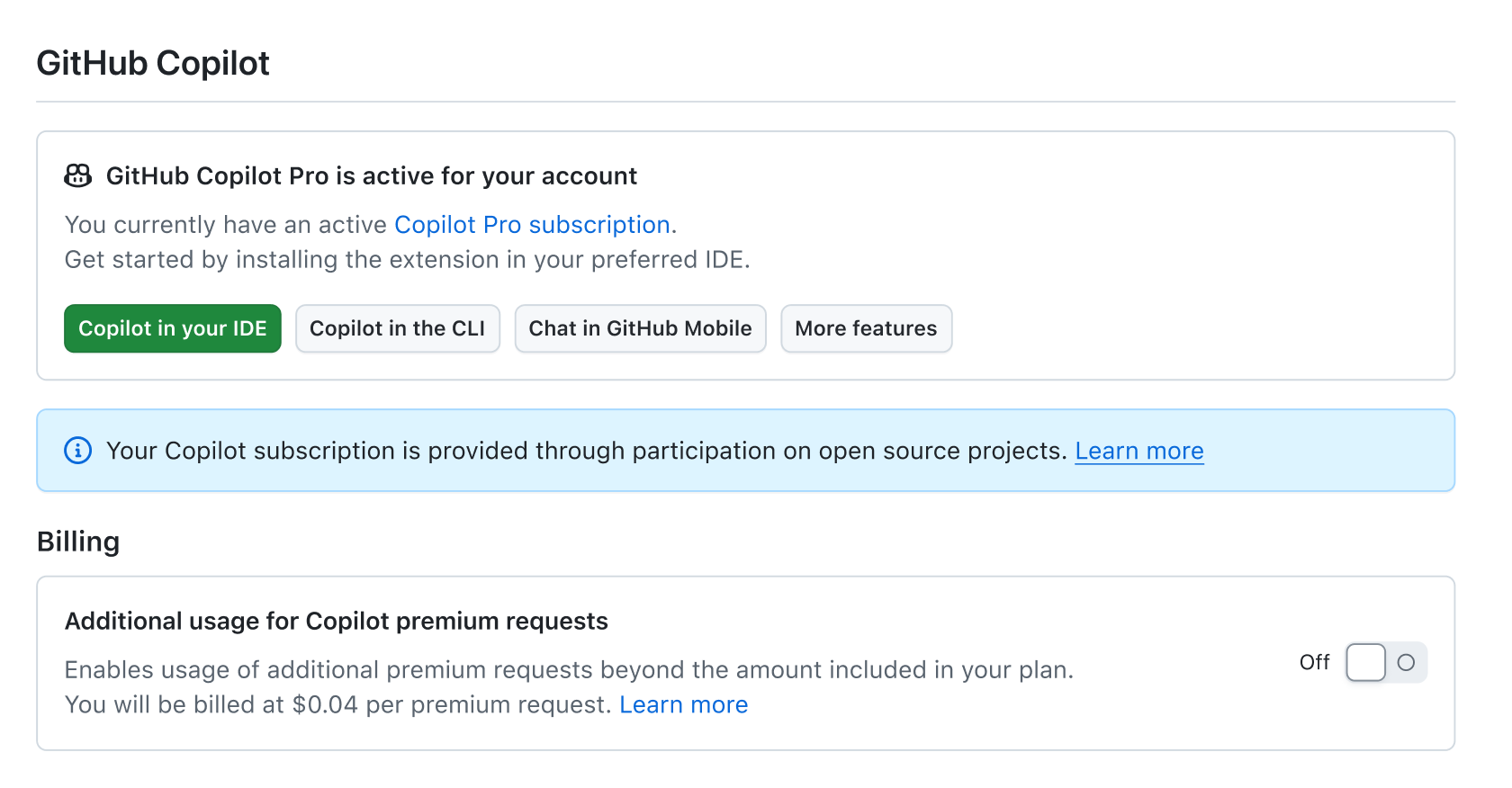
Copilot's billing and upgrade flows were long and inconsistent across SKUs, leading to friction and high drop-off rates.Previously, users couldn’t see pricing details until after they logged-in. Not surprisingly, we saw a lot of drop-off prior to that. Low completion rates led us to investigate and discover users were being thrown between multiple “chained” sign-up flows and authentication experiences, facing broken UX loops and functional bugs within the check-out experience.
...after...We opted for reduction at all costs, pre-populating data whenever possible, and ultimately moved additional policy and user preferences out of the billing flow. By simplifying, we were able to turn frustration into anticipation and excitement.
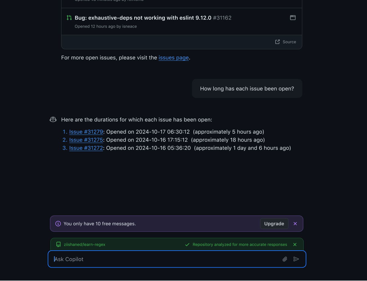
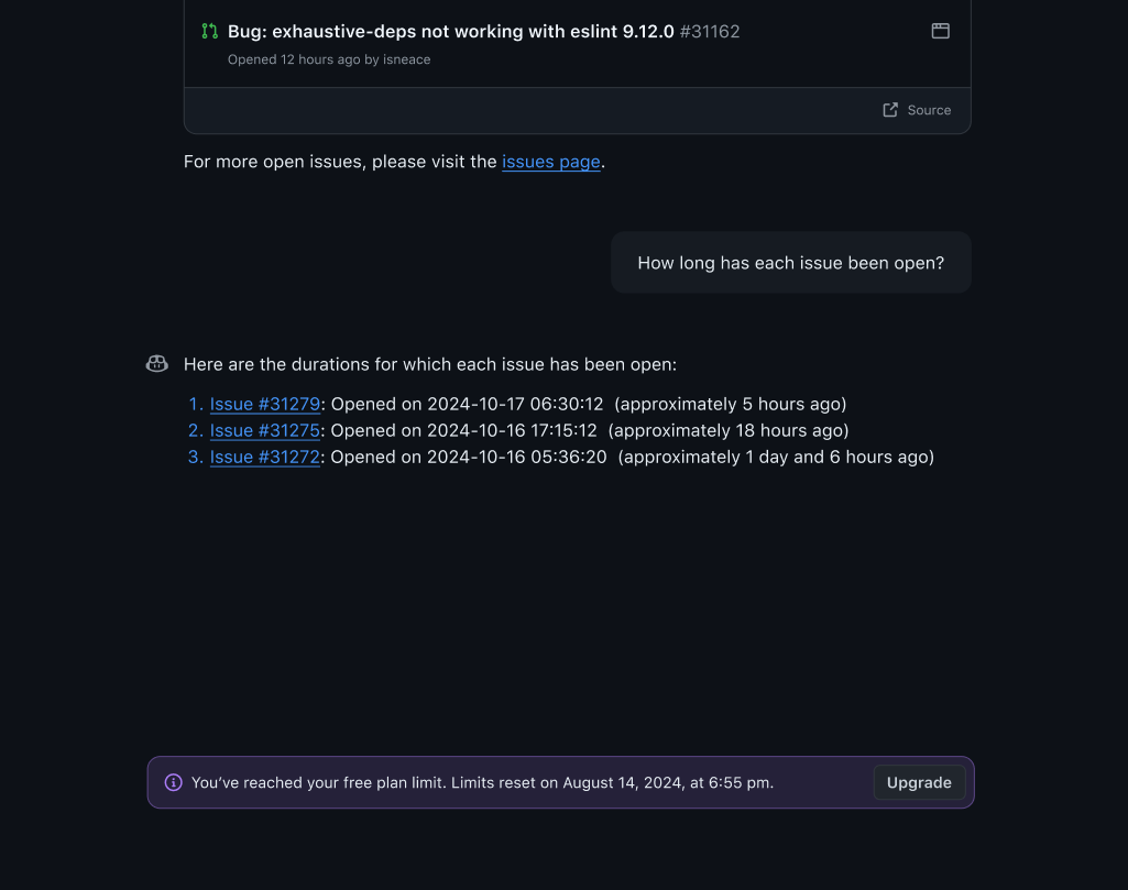
It ain't over yetOur billing flows needed to map several IDES and product surfaces, all of which helped us patch several unforseen gaps. We also knew we needed to account for new billing models.
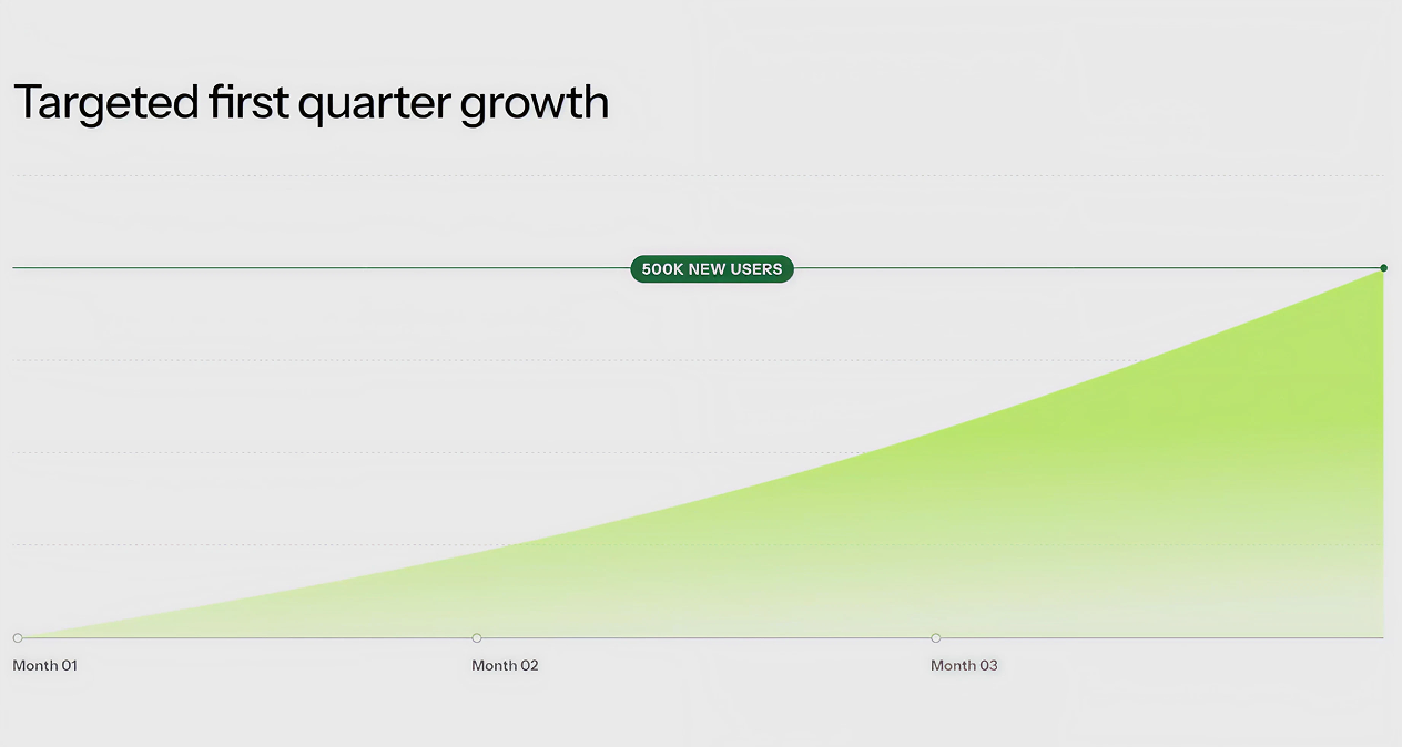
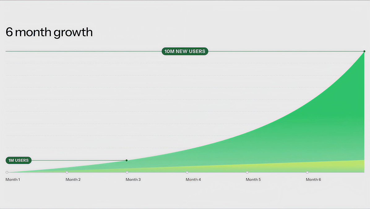
Drum roll pleaseWe ended up reducing 13 billing steps to 4, and added clear in-product upgrade and trial paths, contributing to record breaking growth across the company.
Happy lil accidentsThis was the most demanding launch of my career. Ask me about the mistakes we made that inspired better processes, and how we broke design silos that inspired closer collaboration between brand and product designers.