Invisionapp.com
Navigation Overhaul
About
InVision is a leading digital product design platform that you may have already heard of. The
InVision app enables entire product design teams to stay connected through a single workflow. As
a lead marketing platform designer, I was tapped to improve the global navigation experience.
The goal was to paint a clear picture of InVision’s business offerings, improve information
architecture for future updates and solidify a single global experience to help pay down
technical debt. All while promising increased metrics in exchange for stakeholder alignment. Ya
know, no biggie!
Team
Sr. Design Lead
Sr. Marketing Director
Engineering Director
Sr. Engineer
Product Manager
Responsibilities
User Research
User Testing
Site Mapping
Wireframing
Visual design
Interaction design
Development handoff
Design QA
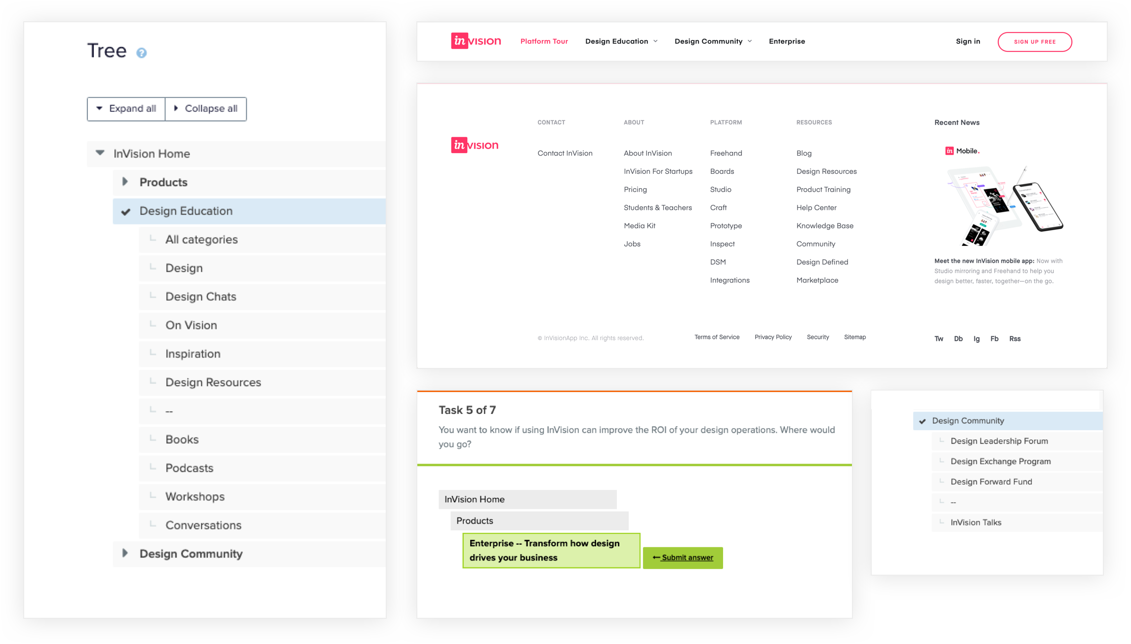
Gathering
quantitative and qualitative data allowed us to marry user needs with
business objectives. With
quanitative data making it easier to focus which areas the business wanted to improve, we took to user
testing to figure out the “why” behind the numbers. A tree jack test allowed us to validate our content
groups but there was massive room for improvement when it came to labeling.
Point blank, our customers had no idea what our products actually did and our sub-brands were completely
unintuitive. So we made some revisions and took it to moderated user testing for more clarifying
feedback regarding where users got tripped up and what keywords they were searching for.
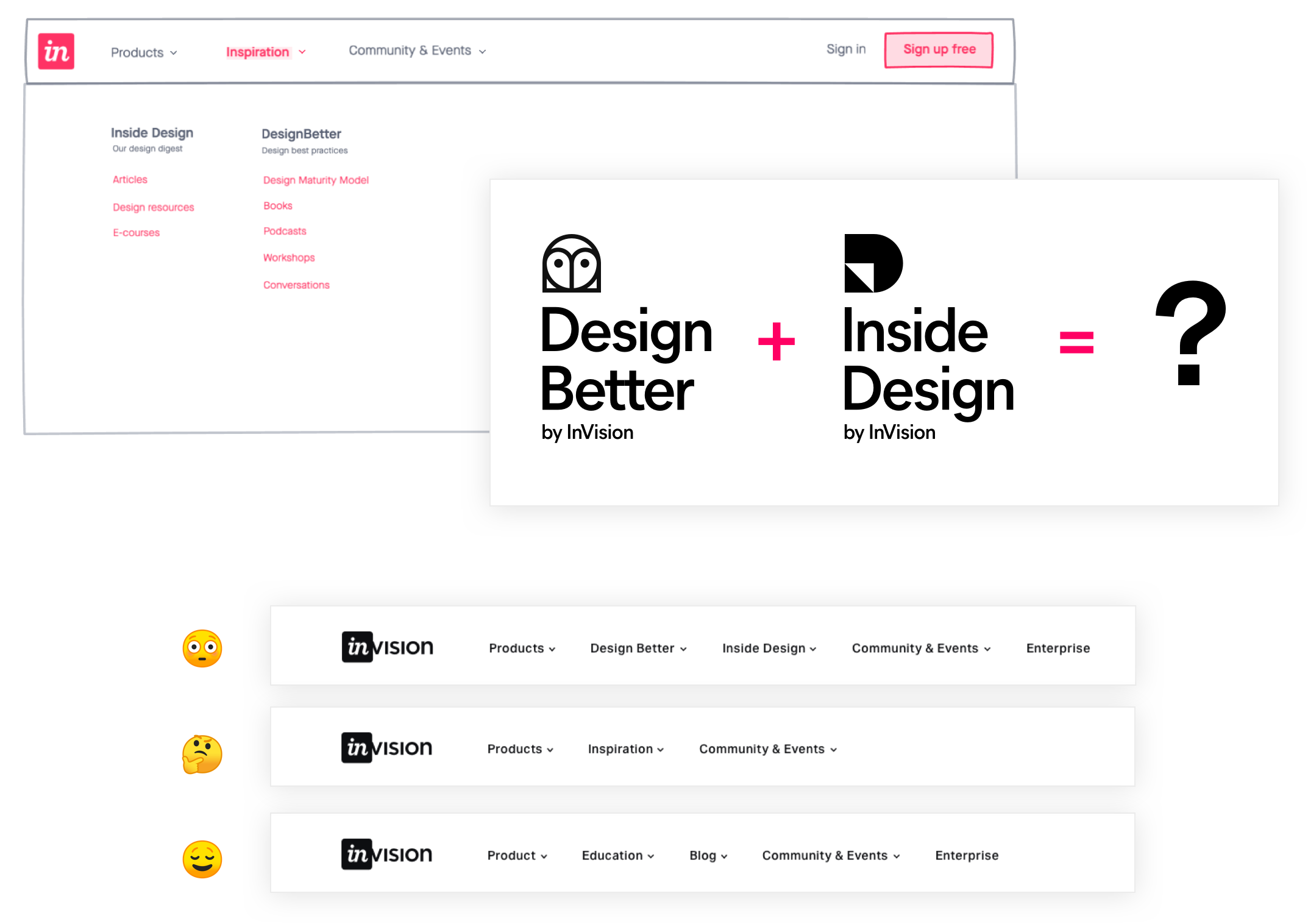
We knew we wanted to eventually roll out two distinct content sub-brands into one.
Rather than create a junk drawer with “blah” labeling, we opted for separating them out. This would be a
temporary interim state before the magic launched.
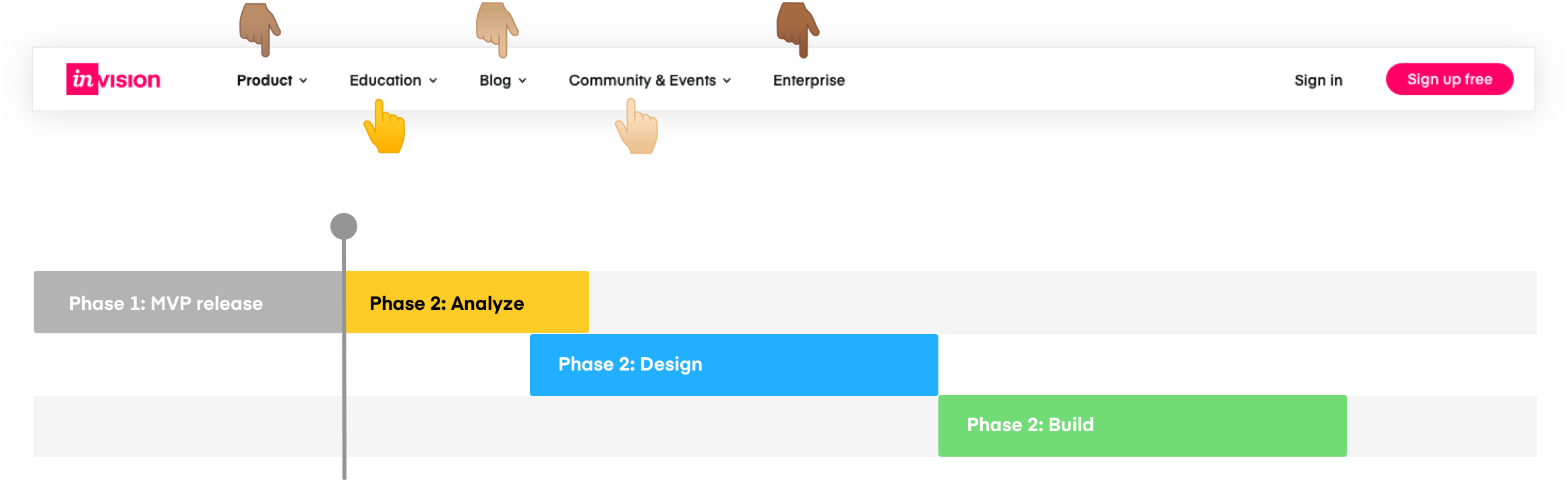
By making
products and editorial content easier to find, we were able to convey
a more complete company offering. Anyone who’s performed user testing knows it’s like going through the five stages
of grief. You have to come to terms. A critical shift was lifting our product offerings from the footer
into the main navigation and give our money makers the spotlight. Although our customers resonated with
features over product names, this proved to be too much of a content overhaul for our team.
InVision has the unique challenge of branding each product separately. Any additional feature page would
only cost time and money, in addition to distracting users from landing on the very pages we want to
highlight. The idea was scrapped in favor of spotlighting our products exclusively.
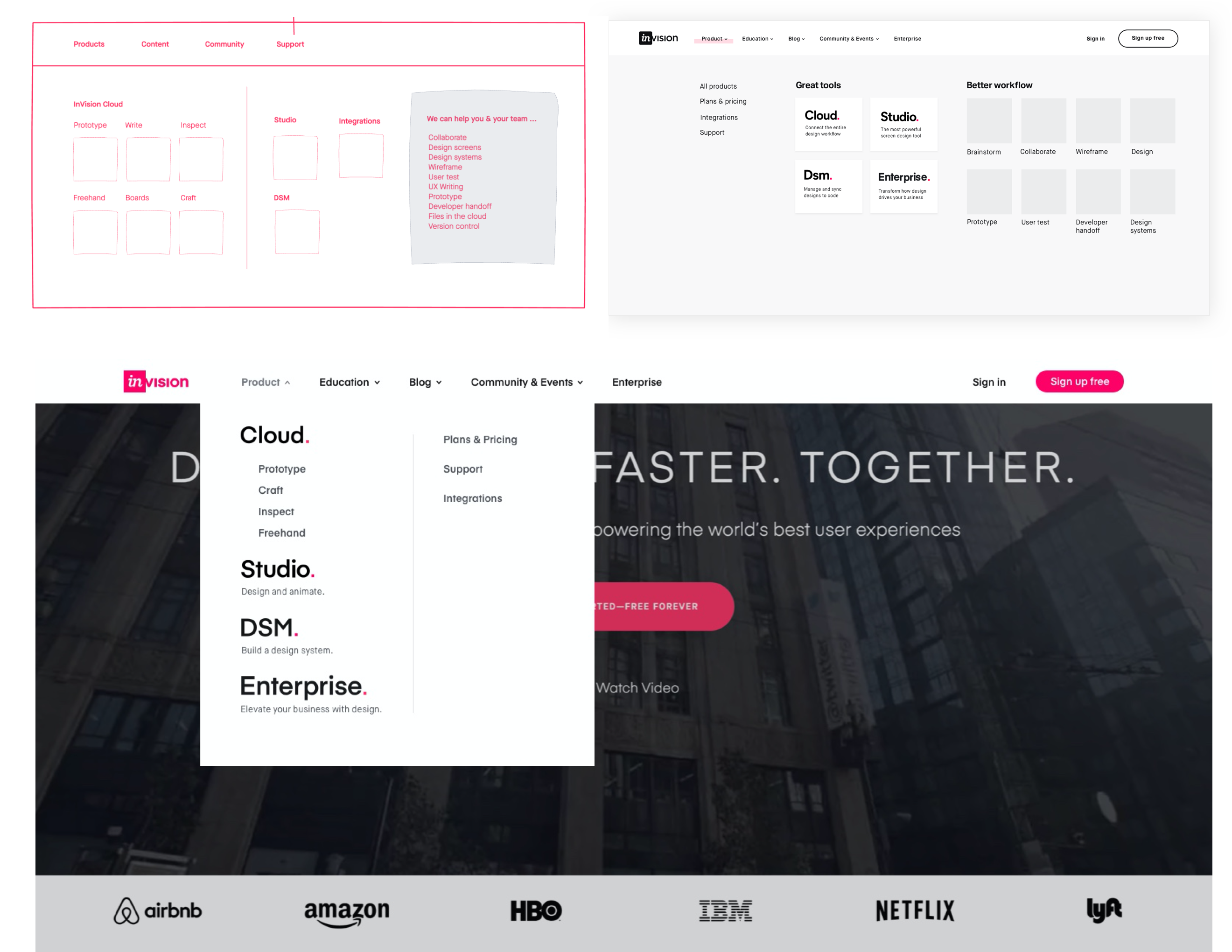
Thinking systemically, we standardized a global pattern that would adapt
to
both product and content marketing. With a new IA intact, the rest fell into place. We designed a single
secondary navigational pattern that would flex between content and product pages. Our old stack was
riddled with one-off landing pages, void of clear wayfinding and disconnected naviagtion layers. By
bringing them all under the same umbrella, we produced a very clear picture to our users and built a
strong CMS-driven governance plan.
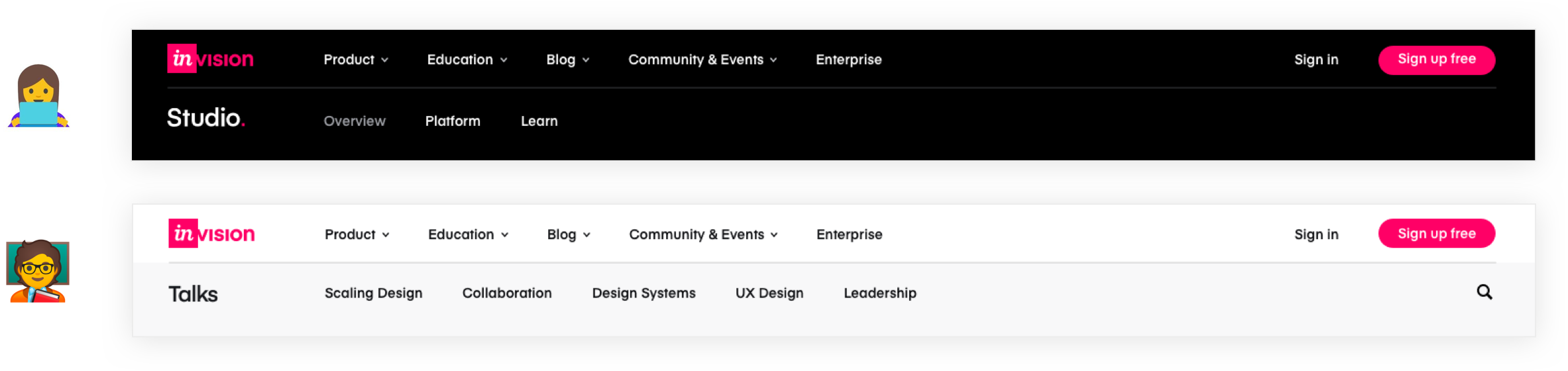
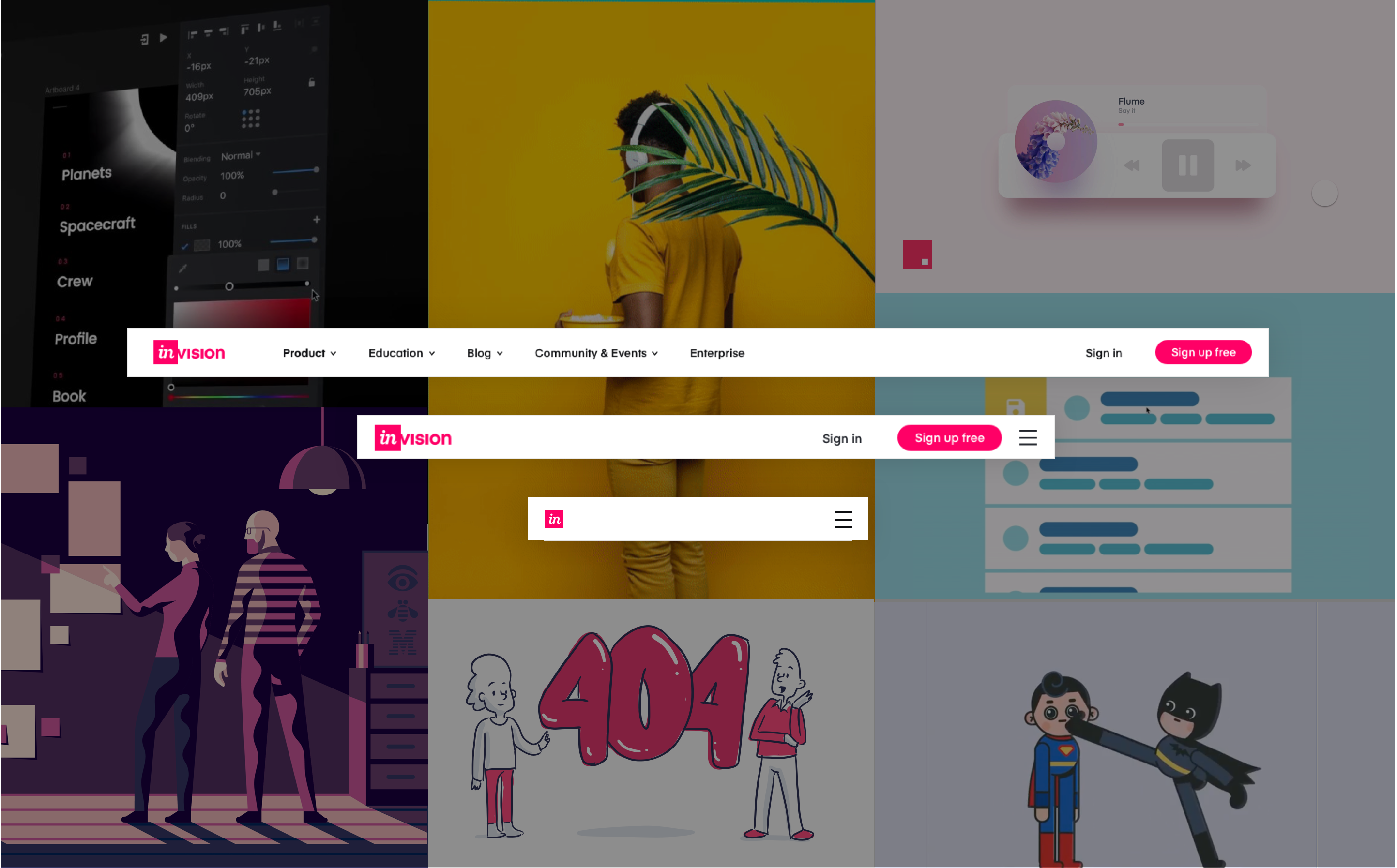
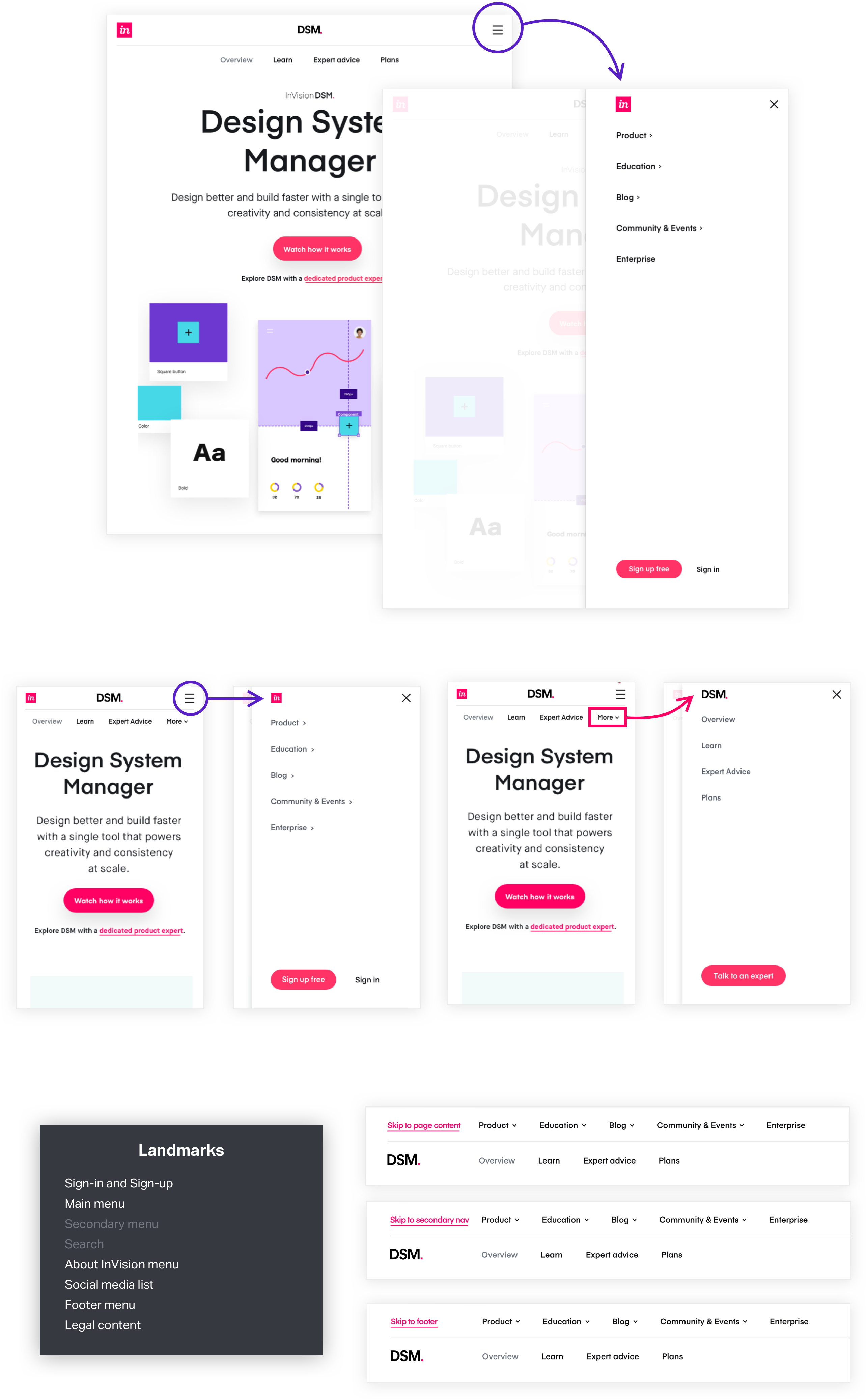
No matter
the device, our navigation maintained essential information for every
interaction.
By combining native app patterns with web, we were able to ensure that no navigation or wayfinding
was unclear to our mobile and tablet users. We challenged ourselves to create menu’s that allowed
for progressive exposure while maintaining clear hiearchy and wayfinding interactions. By thinking
systematically about our design elements, we repurposed existing patterns across responsive
breakpoints, saving essential development time.
By treating the nav as
a product, we’re able
to make constant improvements.
Our old code stack lacked consistent tracking due to too many disconnected pages and navigation
instances. With a new foundation in place, the entire marketing organization was prepped to monitor
new progress and changes for optimization. With a clear vision for future work and a pressure tested
content map, we created a team dedicated to treating the navigation as it’s own product worth
iterating on. And that, deserves a chefs kiss.